Photos 3 - Deep Space
- Henry Whiteley
- Sep 20, 2024
- 1 min read
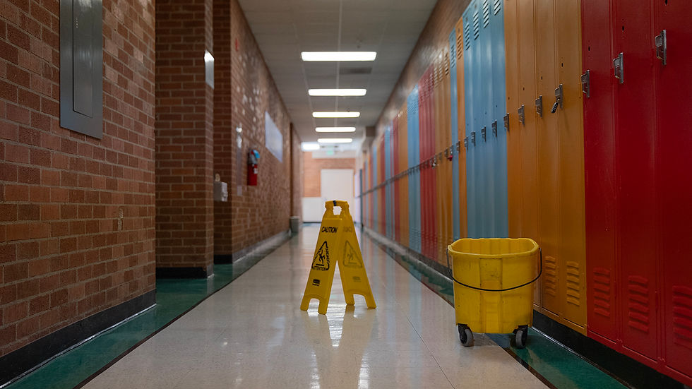
This yellow warning sign is the center of attention for a number of reasons. The lines from the tiled floor, the line caused by the intersection between the ceiling and the walls, the shrinking lights, lockers and bricks lead the eye to the object. This is symmetry is broken by the mop bucket that sits to the right, giving it something unexpected.
This next cleaning supply shot relies more heavily on lighting than the previous shot. The shape of the ceiling lights shrinking in the distance gives depth to the image. The dramatic lighting brings an element of emphasis on the subject, aided by the variety of depth cues.
Converging lines caused by hand rails and the shrinking windows causes depth. Additionally, the texture of the brick becomes less clear the further ones eye follows them. The harsh shadow creates an additional line for depth. This all draws the eye to a lonely tether ball, sitting bored. Though the convergence point is out of frame, depth is still very present in the photo.


The first photo is very visually engaging. The deep space is clearly emphasized, and the placement of the bucket and sign pop out in a way that balances the image well. I love how the texture of the walls and lockers are a bit less saturated and almost look fake, creating a liminal sort of effect.
The second photo is somehow a bit grittier than the first even though it's brighter. The space is still deep, but I wish the subject and composition were more different than the first to showcase a different method of creating deep space.
The last photo is visually distinct from the other two and uses converging lines in a different way that still manages to…